Since Pinterest is a visual search engine, the design of your pins plays a crucial role. But a beautiful image alone isn’t enough to succeed with your business on Pinterest. A thoughtful pin design helps you target your audience precisely and anchor your brand in the minds of your dream customers. Below, we’ll look at how to design your pins optimally.
What Makes a Good Pin Design?
A perfectly designed pin combines some design rules with a message that is relevant to your target audience at the moment they’re searching.
Before I give you design tips, you should be clear about what people actually want on Pinterest. Users are on Pinterest because they actively search for inspiration and ideas that fit their life and personal taste. A perfectly designed pin delivers exactly the content your target audience is looking for at that moment and triggers a specific intention. This could be the desire to put an idea into action, the intention to buy a product, to explore a topic more deeply, or simply craving a particular dish because it looked delicious on the pin.
Remember: in an optimally designed Pinterest pin, the message you want to convey and appealing design go hand in hand.
When preparing your content for Pinterest, always keep in mind what information your dream customer is currently searching for and what needs they have. This helps you find messages that are relevant to your audience at that time. Tip: Use different messages for the same topic to cover as many search intents as possible.
The better you know the interests, tastes, and (search) intentions of your audience, the more precisely you can address them with your pins. A deep understanding of your target audience is therefore crucial on Pinterest.
What to Pay Attention to When Designing Pins
Once you’ve decided on the message you want to convey to your audience and the action you want to achieve, it’s time to design your pins attractively.
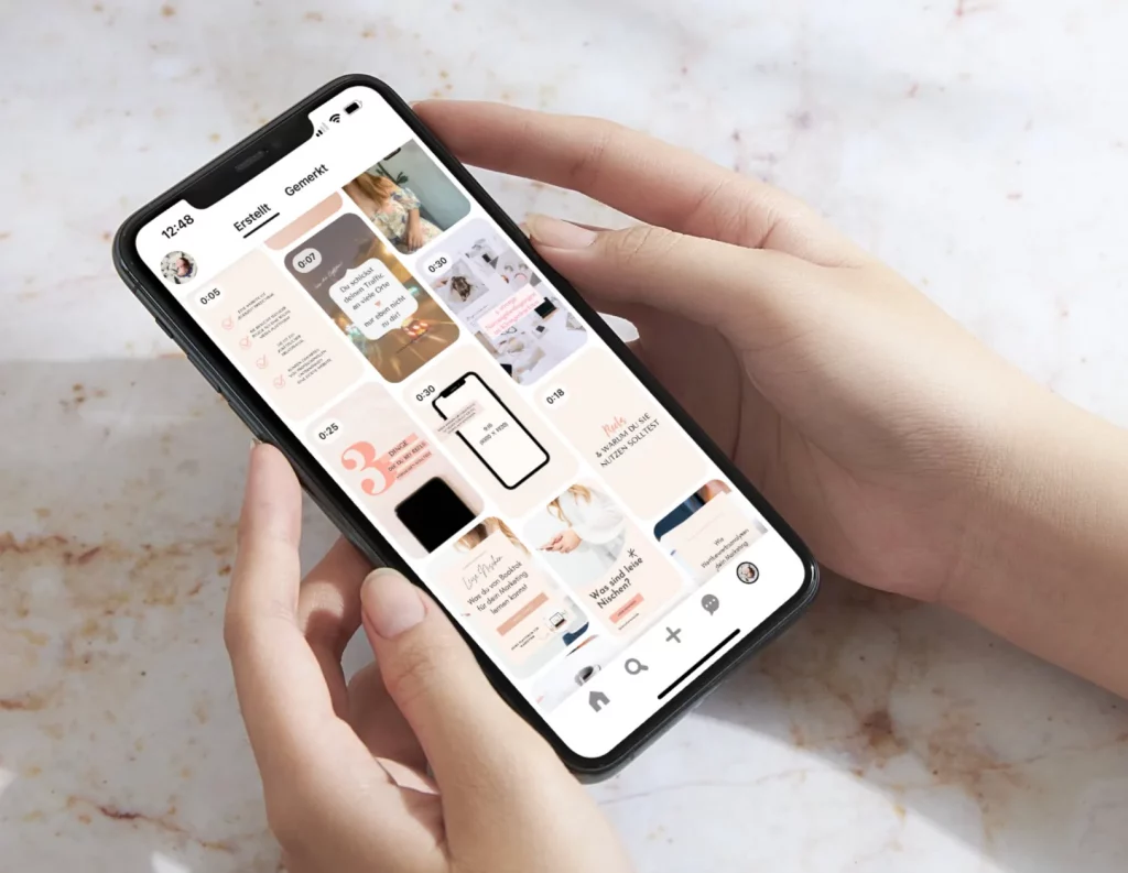
Set a design guideline and stick to it. Pins should always be designed in your branding. Choose 2–3 colors and 1–2 fonts that you use consistently for all your pins. This not only strengthens your brand but also helps your audience recognize your content faster and build trust in you and your content. Use harmonious colors and appealing elements. Ideally, create a set of 5–10 different pin designs that you rotate regularly. Make sure to create templates in different pin formats, e.g., “giraffe pins” for infographics. Your branding should be subtle. This doesn’t mean using only muted colors but that the message of your pin is in the foreground. Your design should not be too wild; instead, make sure your image and/or text stay the focus. Generally: text and image should be understood within seconds. The design should clearly and understandably convey the pin’s message or content without making the user think longer.
If you want to place your logo on your Pinterest pins, it should be no larger than 200 x 200 pixels to avoid taking up too much space. Also, avoid placing it in the lower right corner, as Pinterest may overlay the product symbol there. Alternatively, you can place your URL on the pin — that’s what we do too.
The quality of your design determines how much attention you attract. Use high-quality images. You don’t necessarily have to invest in a photo shoot but can also use stock material (here are my favorite stock platforms). Make sure you have the rights to the images you use . TImages shouldn’t be too dark or pixelated. Visually striking images— like strong contrasts, patterns, unusually staged products, or eye-catching motifs—grab attention and appeal more to your audience’s emotions. This makes your audience more likely to recognize your pins and be ready to take the desired action. As a rule of thumb: the stronger the emotional triggers your pin creates, the better it will perform.
Mobile first – avoid too small or too many elements. Always test your pin design in a small view. Can you still see all important elements clearly and read the text on a smartphone? Avoid headlines smaller than 48 points. Your call-to-actions should be at least 30 points. Avoid overly ornate fonts, as these are harder for the Pinterest algorithm to read. Also, ensure strong contrast between text and background for good readability.
Pro tip: Avoid hashtags in your pin design. Pinterest sees no value in them and may reduce how often your pin is shown in search results.
Perfectly designed Pinterest pins have a clear call-to-action. That means users are encouraged to take a specific action (e.g., saving the pin). Users are more likely to follow the call to action if they know what to expect afterward. So if you want your audience to click on the pin to visit your website, clearly state what they will find on your site.
Checklist: Perfect Pin Design for Pinterest
Let’s sum it up: the design of a Pinterest pin is often the first impression your audience gets of you on Pinterest. A thoughtful design with a clear and relevant message can increase the likelihood that your dream customers will engage with your brand.
Here’s what to keep in mind for your perfect pin design:
- You have 5–10 different designs in various formats
- You use no more than 2–3 different fonts, none too ornate
- The image is eye-catching and matches the content and message
- Your pin is designed in your branding and has recognition value
- Your logo or URL is not placed in the lower right corner
- The pin is still easily readable in small format
- The message is clear and quickly understandable
- You include a call-to-action
Save this Post on Pinterest
